UPDATE: Buffalo Wild Wings has updated their site since this post was originally written. I’ve included an update at the bottom.
Last Thursday I was craving some buffalo wings from my favorite wing place, Buffalo Wild Wings. Being Thursday I knew they were offering their “Boneless Thursdays” special. I just wanted to call in my order so I could pick it up and bring it home. I was not sure of the quantities offered for boneless wings and I don’t like wasting someone’s time on the phone asking. It’s hard enough for them to get my name right with all the commotion in the background. I decided to pull up their site on my mobile phone in search of a menu.
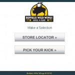
I was glad to see they had a mobile site because their main site would have taken an hour to download on my mobile device. The mobile site loaded quickly on my phone, unfortunately there was no menu link to be found. I was just presented with find a location, and pick your kick.
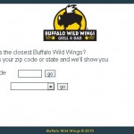
OK… maybe if I search for my location the menu will be on the restaurant location page…
Search by zip code or state…Really? State? Maybe if a visitor is out of town and doesn’t know the zip code they are currently in, but you expect to find a location by browsing through all the locations in that state and instantly know in relation one is to where they are? I might as well just load up Google Maps and search for Buffalo Wild Wings near my location.
Anyway back to my search for a menu. OK, punch in my zip code and hit enter and on the next page I’m presented with this: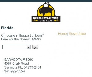
“Oh, you’re in that part of town? Here are the closest BWW’s”
What do you mean “Oh, you’re in that part of town?” What’s wrong with that part of town? I live in that part of town. I’m sure that whoever decided to put this statement at the top of results was trying to be cute, different, and I’m sure they probably intended it to be enthusiastic. Unfortunately it’s hard to portray emotion over the web and this statement can be interpreted two different ways. After reading this I was a little bit insulted, and lost my craving for wings. I never did find the menu either, the original reason why I was on their site.
Just to make sure I wasn’t the only one who took this statement the wrong way I asked a couple of people in the office to find the nearest Buffalo Wild Wings from their phone, and everyone here thought that same thing when presented with that statement. It’s good to have fun messages on your site but emotion is difficult to portray, and sarcasm is almost always impossible.
Buffalo Wild Wings is typically a fun place to spend your evening watching a game; it’s a great idea to try to bring the atmosphere of your business over to your website. They do a good job of that with their main website, but mobile visitors want information, and they want it fast.
UPDATE: Buffalo Wild Wings has updated their mobile site, and did a great job. On the Home Page of the Mobile site you’re presented with the Menu, Locations, and Specials. Perfect! Exactly what I need nothing more, nothing less. The overall design carries over the branding from the main website, and the store itself. The location finder is now a single field asking for zip or state. The menu is easy to navigate and find what I would like to order. They even kept the humor in the site and wrote it in a way that cannot be misinterpreted; If you do not select a location you’re presented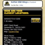 with a message telling you that your phone is going to self-destruct. When your
 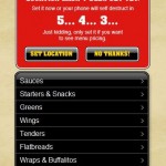 local restaurant is selected I am shown the pricing for each item. The Store location page has the address with a “map to” link, the phone number, and the hours.
I’d love to think that Buffalo Wild Wings saw my post this past summer, and decided to make the changes based on what I had to say but I will never know. They corrected the areas that needed improvement, and then some. Their Web Designers/Developers did a great job with the re-design.


